Monday, 26 November 2012

Double Page Spread Analyses


This DPS includes a pull quote from the article in a bold red to highlight it and attract the reader's attention to it before they read the actual article. The two main images that frame the text are placed so that they separate into two halves and break it up a bit so that it is easier to look at and read. There is no reference to the title of the magazine on this page or a title that says it is a main article. It also includes an image on each page, which is not something that I have seen very often, but is quite effective here.

There is a strong colour scheme here between the model's hair and the USA flag, that also ties in with the title "USA Got the Love". A lot of attention is drawn to this image because of this colour scheme and the way it is placed on the page. We generally read from left to right, so the first thing the reader sees is the image, then the title and then the article and pull quote. The name of the model is highlighted in the pull quote in blue, which is the other colour of the USA flag aside from the ones seen and draws attention to who the article is talking about.

This final article differs quite a lot from the others. It has similarities to a contents page with the column about what else is in the magazine and the splashes that link parts of the magazine together. However, we can tell that it is a DPS by the use of pull quotes in between the text of the article and the large picture and title that links to it. There is still a strong colour scheme present here and the blue used highlights the title, pull quotes, splashes and parts of the column on the left. 

Contents Page Analyses

 This contents page for Q magazine has a clear theme that relates to their logo. The colour scheme is very simple but effective and highlights the important parts of the page - the logo etc. There is no letter from the editor and the purpose of this page is clearly just to show you where the most important parts of the magazine are. There are pictures to accompany each article and a small description of what you will find on each page. This is very effective because it gives the reader an idea of what they are going to be looking at before they see it. This lets them decide if they are interested in that article straight away or will leave it for later and the pictures support that by giving the page some flare and colour.
Unlike most contents pages, this one only uses one main image, similar to conventional front pages. This draws more attention that article, and it suggests that the artist featured is the main story featured in this magazine. The large "V" seen in the background is for "Vibe", the title of the magazine, and keeps a strong theme even though we aren't looking at the front page where the logo and title would be featured. The colour scheme is consistent with the text, "V" and image, creating a strong theme that makes the page look more appealing. The use of the red on the heart is striking and draws attention to that picture, meaning that the reader also sees the caption with it and the story behind the picture. Again, there is no letter from the editor and the page exists purely to deliver information about the articles featured in the magazine.
 Despite the busy appearance of this contents page in comparison to the others, there is still order within the theme, and all of the text fits in with it, either being red or black. There is still no letter from the editor, but there is a small introduction to a possible story in the magazine. NME have used more organisation with their contents page, splitting it into clear sections for the articles, and also have a band index that shows the reader the pages they need to go to if they want to look at a specific band. There are arrows placed around the columns that highlight specific articles that may be of popular interest, as well as a big red arrow at the bottom that leads the reader on to the rest of the magazine.

Monday, 19 November 2012

Images for My Magazine


Test Images

I quite like the angle and framing of this shot, but I don't like how dark the lighting is. You can hardly see much of the model's face, so the audience would probably not find this image very attractive. I will not be using this image in my magazine.
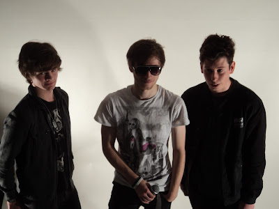
I find it quite difficult to photograph group photos, but I feel that this one was quite successful. The models weren't quite ready for the shot, and I would take another one that made sure they were ready, but the framing and angle work quite well to me. Taking long shots of multiple models can make the picture seem distant and not personal enough with the models, but this medium shot helps us get close to them and shows off enough of their figure to be appealing to an audience.
I feel that this image is too dark to use in my magazine, but the medium shot starting from slightly above the waist works well. This is something you see a lot in magazines as the model is usually cut off at or just above the waist to fit on the page equally.
As mentioned earlier, long shots with multiple models don't really work for me. Even with a single model I feel that they are too distant and don't show enough detail of the model. Costume is just as important as the actual model, so having a closer framed image allows the reader to appreciate the effort gone into making the model look good.
I don't like the chair in this photograph. I have decided, after experimenting with chairs and other props, that the only things I would like in my images other than the model themselves is an instrument of some kind. The chair doesn't look very appealing and has nothing to do with the magazine. If I use any props, I would rather it be instruments and have all of the artists standing.
I really like this image and am considering using it on my contents page. The lighting is good, the framing is right to show the models off really well and the high angle gives them a really nice look.
I like this picture as it is not "normal". Most of the other pictures I took were of models facing the camera, and most even looking directly at the camera. This is effective and rather conventional, but I like the idea of more natural images because they make the reader feel more comfortable with the model and might even feel as though they are connecting with them more and catching them "off duty".

I quite like the idea of not having the model looking at the camera as it makes me feel that they aren't just looking for attention - it is a more natural pose. The newspaper background also seems to be quite effective as it matches the colours of the model's shirt and already is starting to create a theme without even being on a magazine. I think I will use this position that the model is in for some of my pictures to try out.


Sunday, 11 November 2012

Photo Shoot Videos


In our photo shoot, we tried out some crazy positions for the models to be in including handstands and karate-type poses. Neither of these really worked as it was hard to get an image that was clear, even if many were taken at once. It is also not very conventional to have the models in unusual positions, so even if the images had been successful, I still might not have used them.

Saturday, 10 November 2012

Hand-Drawn Drafts


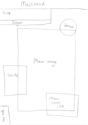
Here are some hand-drawn drafts of a front cover, contents page and double-page spread. These also outline ideas about where each feature of my magazine will go.

Wednesday, 7 November 2012

Publisher Double Page Spread Drafts


All of these drafts were created using Microsoft Publisher and just outline the basic layout of the features of my magazine.

Publisher Contents Page Drafts


All of these drafts were created using Microsoft Publisher and just outline the basic layout of the features of my magazine.

Publisher Front Cover Drafts


All of these drafts were created using Microsoft Publisher and just outline the basic layout of the features of my magazine.