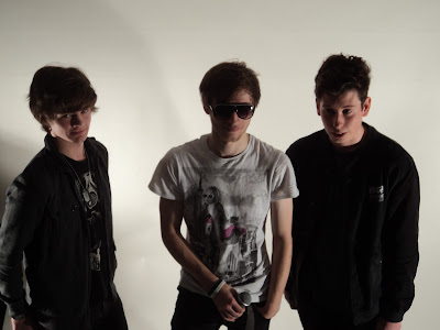
I quite like the angle and framing of this shot, but I don't like how dark the lighting is. You can hardly see much of the model's face, so the audience would probably not find this image very attractive. I will not be using this image in my magazine.
I find it quite difficult to photograph group photos, but I feel that this one was quite successful. The models weren't quite ready for the shot, and I would take another one that made sure they were ready, but the framing and angle work quite well to me. Taking long shots of multiple models can make the picture seem distant and not personal enough with the models, but this medium shot helps us get close to them and shows off enough of their figure to be appealing to an audience.
I feel that this image is too dark to use in my magazine, but the medium shot starting from slightly above the waist works well. This is something you see a lot in magazines as the model is usually cut off at or just above the waist to fit on the page equally.
As mentioned earlier, long shots with multiple models don't really work for me. Even with a single model I feel that they are too distant and don't show enough detail of the model. Costume is just as important as the actual model, so having a closer framed image allows the reader to appreciate the effort gone into making the model look good.
I don't like the chair in this photograph. I have decided, after experimenting with chairs and other props, that the only things I would like in my images other than the model themselves is an instrument of some kind. The chair doesn't look very appealing and has nothing to do with the magazine. If I use any props, I would rather it be instruments and have all of the artists standing.
I really like this image and am considering using it on my contents page. The lighting is good, the framing is right to show the models off really well and the high angle gives them a really nice look.
I like this picture as it is not "normal". Most of the other pictures I took were of models facing the camera, and most even looking directly at the camera. This is effective and rather conventional, but I like the idea of more natural images because they make the reader feel more comfortable with the model and might even feel as though they are connecting with them more and catching them "off duty".
I quite like the idea of not having the model looking at the camera as it makes me feel that they aren't just looking for attention - it is a more natural pose. The newspaper background also seems to be quite effective as it matches the colours of the model's shirt and already is starting to create a theme without even being on a magazine. I think I will use this position that the model is in for some of my pictures to try out.


No comments:
Post a Comment