Friday 15 March 2013

Evaluation Q7


Looking back at your preliminary task, what do you feel you have learned in the progression from it to the full product?

I think that I have learned a lot about using Photoshop as well as learning about how magazines are constructed and the various conventions that people expect to see and what make a magazine good and appealing. When I made my college magazine, I had no idea about the effects that you could put on text and boxes etc. to make them more attractive and fit in with the rest of the theme, such as the stroke, gradient overlay and the various shape tools to make the boxes. My college magazine didn’t have a good colour theme as it was hard to see the cover lines against the background. I've learned from this to have a plainer background, or to put text in boxes with a plain background so that it can be read easily. I also didn’t follow many of the conventions of magazines, such as having a skyline, bar code, tease at the bottom of the page or even a QR code. I included all of these things on my music magazine to show that I understand the conventions and used them to make my magazine more realistic.

I feel as though my contents page has come even further than my front cover. When I made the contents page for my college magazine, I hadn't even really looked at many contents pages to get a feel for how they look. I had some good ideas, but didn't have the right camera and Photoshop skills to pull them off. All I included in my college magazine was a list of things that featured in the magazine, no letters from the editor, pictures of people or organisation of the cover lines. I wanted to make sure I included these things in my music magazine so that there was a little more than just a plain list of items in the magazine on the contents page and so that it looked more professional and appealing to the reader.

I found it useful to carry out the preliminary task before starting on the final products so that I could get used to Photoshop and what kinds of images to take for a magazine. I had no previous experience with Photoshop, so in doing the preliminary task I could discover new things and improve my skills before I started my final products. I think of it as a sort of “trial run” that helped me to get an idea of what I was going to have to do for the course. Without doing the preliminary task, I would also have been unaware of magazine conventions, house style, layout and how to represent certain genres, for example, with the preliminary task, I didn’t know much about fonts and colours, so my cover lines are hard to read and not placed very well, but I changed this for my final product.

If I could change anything about my contents page, it would be the layout of it. I quite like how I have got it, but I would like to at least try having one main image on the left and all of the contents down the right side of the page, with perhaps a few other images along the bottom. I have seen this in a few magazines, and I think it can look quite good if it is done well. As for my front cover, I would change the fonts used to make the cover lines look more interesting and exciting, making the reader want to read them and find out what is inside the magazine.

Another thing that really helped me in creating my product was the feedback that I have received along the way. I have taken the points about my products that I received into consideration and improved my product according to them so that it is tailored more for my audience. The difference between my drafts and final products is diverse, and this is mainly because of the feedback I received.

Evaluation Q6 Transform Scale and Rotation

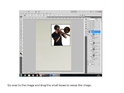
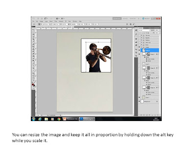
This is the process of how I used the transform tool to rotate and scale my images.


Evaluation Q6 Quick Selection

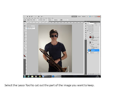
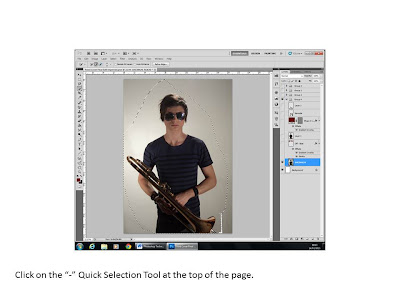
This is the process of how I used the quick selection tool to select parts of images and remove the background.


Evaluation Q6 Layer Style

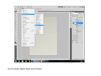
This is the process of how I used layer style to add effects to my text to make it more attractive.


Evaluation Q6 Other Techniques


Evaluation Q6

What have you learnt about technologies from the process of constructing this product?

Before taking on this project, I didn't know anything about Photoshop. It has been very useful to make this magazine to develop my skills and learn what kinds of things are put into creating a magazine. I found it very useful to do the preliminary task to find out what sorts of tools I would need and have a go at practising with them before coming to my final work.

Techniques used:

Quick selection tool - after selecting an object with the magnetic lasso tool to make sure the entire image is selected.

Clone Stamp tool - to remove reflections in the trombone.

Eraser tool, but particularly the soft eraser - to make the edges of the images softer and more appealing.

Text tool - for all of the text included, as well as the ones in the DPS that have been imported from Photoshop.

Line/rectangle/ellipse tool - to create shapes such as the boxes on the contents page or the plug on the front cover.

Transform – scale/rotation - to make images fit and rotate them around to give them an “off-angle” effect, e.g. the image of me on the contents page.

Layer style – stroke, gradient overlay and some colour overlay - to give the text a border around it, a fill effect and change the colour of the boxes on the contents page respectively.

Evaluation Q5 Feedback Questionnaire


Evaluation Q5

How did you attract/address your audience?

The specific features of my magazine that will appeal to my audience directly are the free things in it, the competitions, the artists featured, the quizzes and the general layout. I made my magazine based on most conventions that people will expect to see, such as a plug, skyline and tease, main image of the featured artist and various cover lines with content that make the reader want to buy the magazine and look into them in more detail. I felt that it was important to give readers what they wanted using conventions, but to also challenge and change them a little bit to make my magazine stand out in the crowd.

I wanted my audience to feel like they are “part of the scene” by having artists and articles that relate to them and what they like. I didn't want to feature things that hardly anybody would be interested in, so I chose artists and features that would appeal to everybody. The audience for my magazine is quite a large one, so I needed to include many things that would keep everybody happy and attract many different kinds of people.

I also attracted my audience with the option of looking at the magazine digitally through the use of a QR code linked to the magazine’s website. This means that both people who enjoy physical copies of the magazine and those who enjoy digital ones will be attracted to my magazine. I also added a subscription offer to the contents page to attract long-term readers who want to subscribe to the magazine to get it cheaper. It also appeals to people who don’t go out to shops very often as the offer includes delivery to the reader’s home. There are also competitions and free gifts included and advertised in my magazine with things that relate to jazz and music, such as tickets, posters etc. on offer for the reader.

Evaluation Q4 Feedback Video

Evaluation Q4 NME Reader Profile


This is the NME reader profile that I looked at when I was creating mine. NME have gone into a lot more detail with their profile, but I looked at the main things such as gender, age and socio-economic group when creating my profile. NME know how to make their product appeal to their audience because of their reader profile as it helps them determine what sorts of things would be relevant to include in the magazine to make it popular and make people want to buy it.

Evaluation Q4 Reader Profile


This is the reader profile that I constructed for my target audience. I put on the features about age group and class because I feel that those things are important to most people in society these days. People often classify themselves as being of a certain class or age group, so I made my reader profile to reflect that. I also included some hobbies and interests that my target audience would have, such as playing an instrument, particularly a jazz instrument, using social media and listening to jazz music regularly, or even playing it in a band.

To further help me determine my target audience, I also conducted a focus group session with four people. I asked them various questions about what they would like to see in a magazine and the prices that they would pay for it or the shops that they would look for it in to get an idea of what people in my target audience range would like.

Evaluation Q4

Who would be the audience for your media product?

My chosen audience covers quite a large range of the scale. I targeted my magazine at people who fit into the A – C1 groups of the socio-economic groups, and will be predominantly male, but there are many females who enjoy jazz as well. I also targeted it at both the older and younger generations. I included young and new artists for the younger age groups, and articles about the history of jazz that may appeal more to the older generations. There are also articles that cover both of these age ranges, such as instrument reviews and the latest music. Looking at Maslow's hierarchy of needs, I targeted my audience at people between the safety and esteem groups as taking inspiration from what you read and trying out jazz for yourself is what I want people in my target audience to do. I think that my target audience would fit into the safety group as jazz brings people together, so they would be able to make friends and maybe even create a band. People reading my magazine may already play in bands or go to concerts regularly, which means that they belong to a social group. The esteem group fits in with going to concerts and appreciating the music and the musicians who make it, so they are admiring and respecting them. They may also gain some self-esteem if they are the musicians and people admire and respect them.

Evaluation Q3

Evaluation Q2

Evaluation Q1 DPS


Evaluation Q1 Contents Page


Evaluation Q1 Front Cover


Evaluation Q1 Summary


In what ways does your media product use, develop or challenge forms and conventions of real media products?

I have used the same font for all of the title text and the same font for all of the smaller text, such as the cover lines on the front cover and the contents lines on the contents page. I have also kept a strong colour scheme throughout my product using the colours red, black and white. The page numbers listed on my contents page for the double page spread feature – it is listed as pages 5 – 8 and I have written the article for the first two pages, so the DPS has pages 5 – 6 on it. I have kept the same artist throughout the magazine, and he is the main feature of this particular issue. I have used one extra artist to show that the magazine isn't purely about him only, as well as mentioning many other articles on the contents page. The layout of my products matches conventions with the masthead, bar code, plug and cover lines on the front cover, the “boxy” style of the contents page, letter from the editor and columns of articles that feature in the magazine, and the pull quotes, stand first and a direct address image of the artist in the DPS.

However, I have not followed conventions with my DPS as I don’t have one main image to that artist that connects with the audience on a personal level. I tried that, and I didn't feel as though it really worked for me, so I went for a more “pop-art” style with a sequence of images instead.

Tuesday 5 March 2013

Final DPS Improved


This is my double page spread after improvements based on the feedback I received. I have changed the image to a sequence of images of the artist and made the main pull quote more interesting and "crazy". I have also changed the other pull quotes so that they are smaller ones and are wrapped around the text in the article.