This is my mood board for my college magazine. I have thought about the layout of it and done some research about other college magazines to see the basic magazine conventions. I also looked at some images of Wyke as I am thinking about including images of the buildings or campus on my front cover as the background to show that it is a college magazine.
LIIAR Analysis:
Language - as it is a contents page, you would expect to see short sentences and very little language. It is to the point and delivers the information you need to find what you want to look at in the article.
Institution - again, it is a school magazine that is produced by the school, for the school. They have placed their school logo in the lower right corner and used pictures of their school and students to emphasise the point that the magazine is based around their school.
Ideology - this school conveys its beliefs of the school to be positive and hard-working. Some of the articles are on improving your revision strategies and achieving the best results, which show that the school cares for its students and wants them to do well.
Audience - the audience is primarily the students and teachers at the school as they will be the ones who will understand the school and will be interested in knowing more about it. The parents of the students may also be interested in what is happening at the school their child attends and the progress it is making.
Representation - the school want to represent themselves in a positive way and show their audience that they are hard-working and strive to help their students achieve the best results possible. This contents page also shows us that they want to keep everyone well informed and are organised about how they present themselves.
LIIAR Analysis:
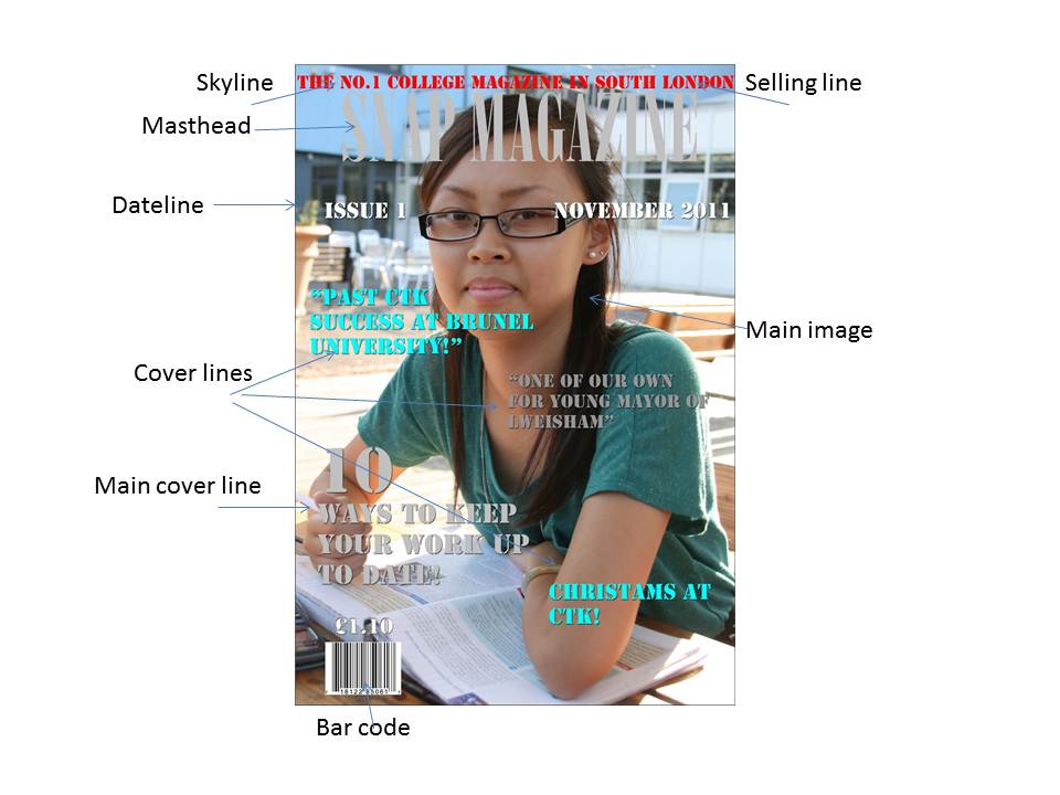
Language - the language used is to the point and highlights the key points that are inside the magazine. A lot of words related to college are also used, e.g. "work", "university" and "success" to convey to the readers that the magazine is college-based. A lot of quotes are also used, these may be quotes from inside the magazine or possibly what people have said about the college and the students there, and give the readers an idea of what is to come.
Institution - the institution for this magazine is clearly the college and they have produced this magazine themselves and distribute it within the college for the students and teachers to read and keep up to date with the latest information.
Ideology - the ideology used in this magazine has a strong, positive opinion of the college. The quotes used are all positive and include information about students moving on from the college to better things. The college also conveys a strong work ethic and wants to help its students improve and keep working hard with "10 ways to keep your work up to date", which is also the main cover line.
Audience - the audience for this magazine is primarily the students and teachers at the college, and doesn't really appeal to anyone outside of the college as they won't know anything about the place. Parents of the students there may also be interested in some of the content, as it applies to the ex-students, and parents may be interested in what their children can achieve after attending the college.
Representation - the way the magazine represents itself is very confident. It has a student with their textbooks as the main image, representing the work side of the college, but then also has the "Christmas at CTK!" cover line, which shows that the college also takes part in festive activities and can take a bit of a break from work and have some fun. This helps the magazine to promote a good image for the college as it shows parents that they work their students hard and allow them achieve anything and move onto greater things, but also that the college allows them to have fun and take part in different activities.
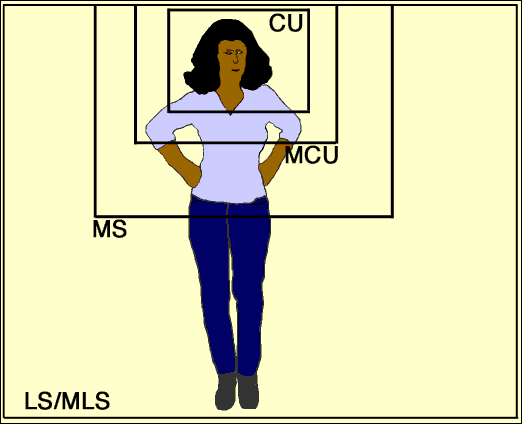
This image shows the different camera framings that can be used when photographing a person. They can also be applied to other objects, such as bottles with labels or buildings, but it is easiest to apply this to people. One shot that this picture does not include is the extreme close-up, which is just a shot of a part of the face, for example the eyes. Different camera framings can be used to create different effects, for example, close-ups and extreme close-ups allow us to see the emotion on someone's face and get close and empathise with them, while medium shots and long shots allow us to see the body language used and more of the background where the person is.
For magazines, it is generally conventional to use mid shots, medium close ups and the occasional close up, for things such as the double page spread.
These are the contents pages that I looked at for my research. Some include the school's name and logo, while others just have general images associated with schools and learning, e.g. pencils, paper and paperclips. A lot of them also use images as well as words so that there isn't too much verbal information being thrown at you as soon as you open the magazine as images are an easy way to see what is in the magazine. This has made me think about how I should lay out my contents page and I am considering using images or other things to explain what is in the magazine, as opposed to just words.
These are some examples of existing school and college magazines that I researched. All include images of the students with their uniforms, sports gear and books to show the audience that the magazine is school-based. A lot of the titles I looked at have something related to school in their names, e.g. "School Weekly" or the name of their school, "Newland News". This has helped me to gather ideas about what I can call my magazine and how I should lay it out so that it is clear that it is a college magazine and so it follows conventions.
This is my annotated copy of a magazine cover that shows the basic magazine conventions used in magazine publishing. I will refer to this when thinking about what to include on my front cover to make it conventional.