Wednesday 19 December 2012

Eighth Front Cover Draft


This is the eighth draft for my front cover. I have considered the audience feedback I received for my last draft and experimented with it. I didn't like having the title in all capitals, or having the bar code horizontal, so I left them as they are. I tried to move my cover lines around a bit to make them more organised and I researched what the most conventional way to place the bar code was and discovered that there is a mixture of horizontal and vertical positions, so I decided to leave mine as it was as having it horizontally would mean that it could get in the way of my main image.

Seventh Front Cover Draft


This is the seventh front cover draft. I have now changed some of the fonts of text and the sizes of words to make them stand out more and emphasise the important information. I have also added a tease at the bottom to entice my audience even more.

I received audience feedback about this draft, here is what people said could be improved:
  • The bar code is sideways - is it more conventional to have it horizontally?
  • The cover lines are just dotted around.
  • Make the title all capitals to make it stand out more.
I also received positive comments, which were:
  • Good colour scheme and layout that represents the genre
  • Photograph looks professional and high quality.
  • Looks realistic how the main image overlaps the bottom graphics.
Looking at this feedback, I am going to experiment and try out the improvements that I have received and see if I like them.

Friday 14 December 2012

Sixth Front Cover Draft


This is sixth draft for my front cover. I have now moved the cover lines around to fill the space around my main image, edited the title, masthead and "inside this issue" line slightly using the gradient overlay tool to make them stand out more. I also changed the font of the text on my bar code and edited the shapes around it slightly to make it smoother and look more professional.

Again, I am fairly satisfied with my front cover and have no major things to edit. I will just continue to experiment and try out new things and see if I like them. The main articles of text now stand out more from the rest, the space around the main image is filled and my bar code looks more realistic.

Tuesday 11 December 2012

Fifth Front Cover Draft


This is the fifth draft for my front cover. I have taken out two of the cover lines and replaced them with teases about artists and where they are performing as well as saying that I have interviews with one of them.

I am now pretty satisfied with my front cover, though I may still look to improve the overall quality of my image and text to make it just that little bit more appealing. The issue of empty space is also still present.

From here onward I will just add more cover lines and play with the fonts and effects to change the layout and look of the front cover to make it look more conventional and appealing.

Tuesday 4 December 2012

Fourth Front Cover Draft


This is the fourth draft for my front cover. I have now moved the bar code to the more conventional right-hand side and placed a date and price (in pounds, euros, US dollars and Canadian dollars, as seen on an issue of NME that I looked at for ideas) above it. I have also moved all of my cover lines to the left-hand side and arranged them, but I am still not completely happy with how they look. The whole front cover still looks rather empty.

Things still to work on:
  • Arranging the cover lines so the are more evenly spaced, maybe even adding extra to "fill the space" more.
  • Possibly edit the image to make it more appealing, e.g. soften the edges if needed or change skin tone etc. (though I am quite happy with how it is now)
  • Generally edit the text so differ between the title and masthead etc. so that the more important features stand out more.

Third Front Cover Draft


This is the third draft for my front cover. I have added a main cover line as my other drafts didn't have one and put a stroke around the main articles of text - the title, main cover line and the plug text. I have also finally fixed the problem with the main image and text overlapping and made the text go behind the image by cutting out the model and putting him on top of the original image.

Things I still need to improve/add are:
  • Finer details such as date of the magazine, price etc.
  • Organise the cover lines to be more conventional - move the cover lines all to the left, keep the main one central and fill the space around the image with them.
  • Move the bar code to the right side and place the price and date with it - this is more conventional.

Monday 3 December 2012

Second Front Cover Draft


This is the second draft for my front cover. I have moved the text around to try and keep it off the image and created a better bar code. I still have an issue with the text and main image as I am still trying out methods of achieving what I want. I have found a better and more realistic bar code, but I have not yet moved it because I still have cover lines where it could go.

Things I could still improve include:
  • Making the cover lines bolder, but not as bold as the title.
  • Make the title more prominent and more in focus.
  • Make the picture more appealing.
  • Add more cover lines so there is more to draw the attention of my readers.
  • Add a main cover line so the audience know what the main focus of the magazine is.

First Front Cover Draft


This is the first draft for my front cover. I made sure I had the basics, such as a title, masthead, main image, plug, bar code and cover lines. These are conventional to all magazines and are something I will need to keep throughout my drafts. I can make them more appealing using different editing tools, but they must stay there. I had a problem with the text and main image overlapping as my whole image is just a single layer. I tried to rub out the text so that it appeared to be behind it, but it hasn't been very successful so far.

Things to improve on:
  • Try swapping the plug and cover lines around so they aren't covering the main image and the colours aren't clashing.
  • Try and establish more of a colour scheme.
  • Move the bar code according to the cover lines and splash - find a more realistic one.
  • Edit image to make it more appealing.
  • Looks very basic and there is too much space around the main image.

Monday 26 November 2012

Double Page Spread Analyses


This DPS includes a pull quote from the article in a bold red to highlight it and attract the reader's attention to it before they read the actual article. The two main images that frame the text are placed so that they separate into two halves and break it up a bit so that it is easier to look at and read. There is no reference to the title of the magazine on this page or a title that says it is a main article. It also includes an image on each page, which is not something that I have seen very often, but is quite effective here.

There is a strong colour scheme here between the model's hair and the USA flag, that also ties in with the title "USA Got the Love". A lot of attention is drawn to this image because of this colour scheme and the way it is placed on the page. We generally read from left to right, so the first thing the reader sees is the image, then the title and then the article and pull quote. The name of the model is highlighted in the pull quote in blue, which is the other colour of the USA flag aside from the ones seen and draws attention to who the article is talking about.

This final article differs quite a lot from the others. It has similarities to a contents page with the column about what else is in the magazine and the splashes that link parts of the magazine together. However, we can tell that it is a DPS by the use of pull quotes in between the text of the article and the large picture and title that links to it. There is still a strong colour scheme present here and the blue used highlights the title, pull quotes, splashes and parts of the column on the left. 

Contents Page Analyses

 This contents page for Q magazine has a clear theme that relates to their logo. The colour scheme is very simple but effective and highlights the important parts of the page - the logo etc. There is no letter from the editor and the purpose of this page is clearly just to show you where the most important parts of the magazine are. There are pictures to accompany each article and a small description of what you will find on each page. This is very effective because it gives the reader an idea of what they are going to be looking at before they see it. This lets them decide if they are interested in that article straight away or will leave it for later and the pictures support that by giving the page some flare and colour.
Unlike most contents pages, this one only uses one main image, similar to conventional front pages. This draws more attention that article, and it suggests that the artist featured is the main story featured in this magazine. The large "V" seen in the background is for "Vibe", the title of the magazine, and keeps a strong theme even though we aren't looking at the front page where the logo and title would be featured. The colour scheme is consistent with the text, "V" and image, creating a strong theme that makes the page look more appealing. The use of the red on the heart is striking and draws attention to that picture, meaning that the reader also sees the caption with it and the story behind the picture. Again, there is no letter from the editor and the page exists purely to deliver information about the articles featured in the magazine.
 Despite the busy appearance of this contents page in comparison to the others, there is still order within the theme, and all of the text fits in with it, either being red or black. There is still no letter from the editor, but there is a small introduction to a possible story in the magazine. NME have used more organisation with their contents page, splitting it into clear sections for the articles, and also have a band index that shows the reader the pages they need to go to if they want to look at a specific band. There are arrows placed around the columns that highlight specific articles that may be of popular interest, as well as a big red arrow at the bottom that leads the reader on to the rest of the magazine.

Monday 19 November 2012

Images for My Magazine


Test Images

I quite like the angle and framing of this shot, but I don't like how dark the lighting is. You can hardly see much of the model's face, so the audience would probably not find this image very attractive. I will not be using this image in my magazine.
I find it quite difficult to photograph group photos, but I feel that this one was quite successful. The models weren't quite ready for the shot, and I would take another one that made sure they were ready, but the framing and angle work quite well to me. Taking long shots of multiple models can make the picture seem distant and not personal enough with the models, but this medium shot helps us get close to them and shows off enough of their figure to be appealing to an audience.
I feel that this image is too dark to use in my magazine, but the medium shot starting from slightly above the waist works well. This is something you see a lot in magazines as the model is usually cut off at or just above the waist to fit on the page equally.
As mentioned earlier, long shots with multiple models don't really work for me. Even with a single model I feel that they are too distant and don't show enough detail of the model. Costume is just as important as the actual model, so having a closer framed image allows the reader to appreciate the effort gone into making the model look good.
I don't like the chair in this photograph. I have decided, after experimenting with chairs and other props, that the only things I would like in my images other than the model themselves is an instrument of some kind. The chair doesn't look very appealing and has nothing to do with the magazine. If I use any props, I would rather it be instruments and have all of the artists standing.
I really like this image and am considering using it on my contents page. The lighting is good, the framing is right to show the models off really well and the high angle gives them a really nice look.
I like this picture as it is not "normal". Most of the other pictures I took were of models facing the camera, and most even looking directly at the camera. This is effective and rather conventional, but I like the idea of more natural images because they make the reader feel more comfortable with the model and might even feel as though they are connecting with them more and catching them "off duty".

I quite like the idea of not having the model looking at the camera as it makes me feel that they aren't just looking for attention - it is a more natural pose. The newspaper background also seems to be quite effective as it matches the colours of the model's shirt and already is starting to create a theme without even being on a magazine. I think I will use this position that the model is in for some of my pictures to try out.


Sunday 11 November 2012

Photo Shoot Videos


In our photo shoot, we tried out some crazy positions for the models to be in including handstands and karate-type poses. Neither of these really worked as it was hard to get an image that was clear, even if many were taken at once. It is also not very conventional to have the models in unusual positions, so even if the images had been successful, I still might not have used them.

Saturday 10 November 2012

Hand-Drawn Drafts


Here are some hand-drawn drafts of a front cover, contents page and double-page spread. These also outline ideas about where each feature of my magazine will go.

Wednesday 7 November 2012

Publisher Double Page Spread Drafts


All of these drafts were created using Microsoft Publisher and just outline the basic layout of the features of my magazine.

Publisher Contents Page Drafts


All of these drafts were created using Microsoft Publisher and just outline the basic layout of the features of my magazine.

Publisher Front Cover Drafts


All of these drafts were created using Microsoft Publisher and just outline the basic layout of the features of my magazine.

Tuesday 30 October 2012

Ideas About Magazine Images


These are the ideas I have about the images that I will use in my magazine. I will take many different images of different people, even if I don't end up using them, just to get used to using the camera and the different lighting and positioning etc. For the background of my images, I will use plain colours and possibly the magazine-style background that is available in the green room. I may also use a brick wall background for my main image, bur I think that a plain background with good lighting would be better.

Main Image and Other Images

Along with thinking about the name of my magazine, I have also thought about how I will frame my images and what I will take photographs of.

On my front cover, I would like an image of a musician in a mid shot. I would like them to be holding an instrument, preferably a trombone, trumpet or saxophone as all of these instruments are used in jazz bands. I would try taking photographs straight-on, but I would also like to have them playing the instrument and facing to the side slightly. If I were to take a picture from the front, I wouldn't have them playing their instrument as it may give it too much importance and I want both the instrument and the musician to be of equal importance.

For the contents page, I would like a background image that I can paste text over easily. I would ideally like a group of jazz musicians either playing together or just lined up with their instruments. I would use a long shot for this so that you could see all of them fully. I just want it to be subtle and in the background and not take over the page. I may use smaller images around the page that relate to stories that I highlight - all of these would be close-ups.

On the double page spread, I would have images relating to my story, and I have not yet chosen what I will write about, but I know that it will be related to them. I would use whatever framing seemed appropriate for the images.

All of these are just ideas, and I expect that when I come to making the products, things will change after experimentation.

Costume, Mise-en-Scene and Lighting Ideas


This is a Prezi containing my thoughts about mise-en-scene, costume and lighting for my images.

Monday 29 October 2012

Fonts

After considering the theme of magazine in more detail, I started to think more about a font that I could use. http://www.dafont.com/ has a lot of fonts available, and has provided me with some inspiration. I may choose to use some of these fonts in my magazine, but I mainly looked for inspiration.

Pricing and Subscriptions

My target audience ranges from people who probably can't afford to spend much on magazines or other leisure items, to people who could spare a few pounds for a magazine if they really enjoyed it. With this in mind, I think that my jazz magazine should be priced at around £1.75. I have looked at the prices of other music magazines, and they range from roughly £1 (it was $1) to £2.20, with some more expensive ones having prices of £6.60! I want my magazine to be available to all, but not seem as though I am offering a low-quality magazine just because it is at the lower end of the price range. If people think that my magazine is too cheap, then they are not the type of people who should be reading a jazz magazine anyway, they would be more suited to spending over £5 on a magazine and feeling that they have bought a high-quality magazine just because of its price tag.

I would like my magazine to be fortnightly. I don't want it to be weekly because I feel that weekly magazines don't give the readers long enough to fully enjoy the magazine before the next issue comes out, especially if they lead a busy lifestyle. They would read a magazine to take a break from their working lives, so churning them out every week and not giving them the opportunity to enjoy the magazine to its fullest isn't what would be best for them.

However, monthly magazines, to me, feel as though they come out too rarely, unless the magazine is really packed with lots of information to keep you going until the next issue. From my experience of monthly magazines, I have learnt that not all of them get the formula right and don't have enough information in them to keep you reading for the whole month. I have finished them in a week or so, and felt that I didn't have much to keep me entertained until the next issue came out. It is true that they keep the reader hooked - they want to find out more and are usually willing to wait a month for the next issue - but I feel as though it isn't kind to do that to your reader.

I came to the conclusion that a fortnightly magazine would be between this, and it would mean that I wouldn't have to make my magazine extremely long to last viewers a whole month, which could limit the quality of the content. They would finish the magazine in perhaps just over a week, giving them a little time to wonder what could be in store for them in the next issue, but not tempting them and making them wait a long time for it.

I would rather have a small/medium magazine with high-quality content than a long magazine with hundreds of pages of lower-quality information. I want the best for my readers, and I feel that giving them a fortnightly magazine that is a little smaller than some of the other magazines for around £1.75 would be appealing to them and make them want to keep on buying the magazine. It isn't "cheap", but it isn't exactly way out of my audiences price range either.

Sunday 28 October 2012

My Reader Profile


This is a reader profile I created in response to the NME one. I have included the main things that I think my readers will do and what they will be like.

I think that the majority of my readers will be male because the jazz musicians are predominantly male and some of the instruments used are seen as "male" instruments - such as the trumpet, drum kit and percussion section and the double bass. 

The age ranges are quite different because there are many different types of jazz that appeal to different people. Older people might like the slower "late night jazz" that isn't too upbeat and exciting, whilst younger audiences may enjoy traditional and big band jazz more because of its fast tempo and complicated rhythms. 

The socio-economic class is high because I think that people with higher-paid jobs that require some sort of education and professionalism will enjoy jazz more because it can be a quite a sophisticated genre of music that only certain people will enjoy. However, jazz did start out with working class people just singing tunes together whilst working, so there is nothing to stop lower-class people enjoying jazz too.

Jazz is all about communication and messages behind what you are playing, as well as being able to communicate with the other players in your band to get your ideas across in an organised way. Because of this, I think that the readers of my magazine will enjoy using social media and socialising with large groups of people all at once. This, of course, also includes going out to jazz festivals and concerts and generally just going out with friends.

Finally, enjoying listening to jazz and playing or listening to it regularly will also be a common pastime of my readers. Some people may just be entering the jazz world for the first time, but a majority of my readers will play some sort of instrument or even have a career in music, either teacher, playing or recording.

NME's Reader Profile


NME created a very detailed profile about their readers, and from the comments given at the bottom of the page, it is very accurate. I am looking to create my own reader profile, perhaps not in quite as much detail, but one that will at least show the basics of who I think my audience are.

Thursday 25 October 2012

Target Audience


Who I think my target audience is.

Demographics


Demographics are the groups that audiences can be separated into, and are based on age, gender and socio-economic group. They are helpful when deciding on a target audience for a product and allow you to see clearly how people fit into different groups.

They can be used to separate audiences into groups that can be easily viewed and compared with each other. These groups are really useful to consider when choosing your target audience as you can compare the genre of magazine that you are creating and see where it would fit in on the demographics table, meaning that you can cater your magazine to appeal to the people who are most likely to read it. It also helps with the look of your magazine - different ages of people like different colours, fonts and amounts of text and/or pictures.

As well as the socio-economic groups, it is also important to consider age group and gender. A lot of magazines only appeal to one gender or a certain age group, and they have to use pictures and write articles that those groups of people will be interested in. This is where demographics come in, allowing you to separate and break groups down and look at them in detail so that you can make the best magazine possible for your target audience.

Wednesday 24 October 2012

Tuesday 23 October 2012

Focus Group


I filmed a few of the people in my class who would possibly be of the age to fit my target audience. Out of these four people, I discovered that none of them really like jazz music, but I am certain that there are people out there who will be attracted to my magazine despite this.

The other details, such as price etc. fit well with the ideas that I had for my magazine, so even though the genre may not be the most popular, the features of my magazine will hopefully be appealing to people who are trying out jazz for the first time, or perhaps are interested in jazz to start with.

Even though this focus group are not in favour of my magazine, I am going to go ahead with it anyway and try something that maybe not a lot of people have tried before. I am the kind of person who likes to experiment and try new things. I follow rules and conventions to a certain extent, but bending them slightly can also have great effects.

LIIAR Analysis of a Double Page Spread


LIIAR Analysis:

Language - the main thing that grabs the attention of the reader on this page is the giant pull quote that covers almost as much of the page as the image. It is a quote from Lily Allen, and also features in the text below it. NME have placed it there so that the readers get an idea about what is going to be in the article, but not enough information so that they have to skip it because they know everything. It also serves as a sort of "title" to the story, and helps lead into it before the reader actually starts to read the small text.

Institute - NME will most probably have interviewed Lily Allen themselves and written this article based on what they found out from that. They have used the same image as the one on the front cover to create a "theme" and use an image that the audience will already recognise. Although now we see more of the image, it is still easy enough to recognise and helps to create a strong theme within the magazine.

Ideology - the message conveyed by this double page spread is that NME want to show their audience that they can get up close and personal with the popular musicians. They have conducted the interview themselves and written the article based on what they found out, using a direct quote from Lily Allen herself for the pull quote and "title" of the page. They also most likely took the image themselves and have used it twice in the magazine for consistency and so that they don't have to take many different images that might not match up completely, especially if taken at different times or at different locations.

Audience - the audience for this particular article will be Lily Allen fans and people who are just interested in popular musicians and their music. Again, it will most probably be a younger audience as they are the ones who are most likely to find musicians such as Lily Allen appealing and what to know what is going on with her and why she has said what she has said.

Representation - NME represent themselves as up-to-date with the latest information about the popular musicians and efficient in the way that they gather and present their information. They represent the musicians they feature in a positive and accurate way, using direct quotes from the musicians themselves and attractive photographs so that they appear to be fine and doing well - unless it is serious, no one wants to read about people doing badly. They want to escape the bad things in their life and read about something good.

LIIAR Analysis of a Contents Page


LIIAR Analysis:

Language - on this contents page, there is plenty of information presented to the reader. It is laid out in columns so that it is easy for us to navigate the page and find what we want quickly, despite the page being rather busy. For example, there is a column titled "Band Index" and the latest news, studio news, reviews and live performances on the opposite side of the page. The images used are shots of the main stories from the actual magazine, meaning that readers get a taste for what is to come and quickly go to a story they find interesting by looking at the pictures and getting the page number form them. To accompany the titles of stories there are pictures with page numbers in the corner to give the page a feeling of informality. Too much text would overload the reader and put them off reading the magazine if they knew they would have to wade through a lot of text.

Institute - again, NME would be responsible for creating this page and planning out the design of it themselves. They would gather the images used, in this case they are all of the issue and some of previous/upcoming issues, and choose the layout of them themselves.

Ideology - the message conveyed by this contents page is that the magazine is bursting with information. The design of the page is very busy and as much information as possible has been crammed into just one page, with images, a masthead, titles and columns giving the page some organisation. NME want to show their readers that they have all of the latest interesting information and want to present to us so that we can stay up to date. The organisation used helps us to understand what is going on, and the handy colour scheme and columns with clear titles really help to make the page look tidy and organised.

Audience - the audience for this magazine is, again, the younger generations, starting from around the teenage years. They would be the ones most likely to be able to pick out the information they want from such a busy page and would be interested in what the magazine has to offer. Older people would not feel comfortable if they had to wade through loads of text to find out what they wanted.

Representation - NME want to represent themselves as a company who has all of the latest information about the popular musicians and can give it all to their audience in just one issue. By the time the next issue is due, a lot of more will have happened and they will have fresh information to cover, meaning that even if it seems as though they have a large amount of information in a single issue, they won't run out of stories to cover. They need to provide a lot of information for their audience to keep them interested and satisfy niche audiences as well as mainstream ones.

LIIAR Analysis of a Front Cover


LIIAR Analysis:

Language - the language used on this front cover highlights the points of interest in the magazine. It is short so that it can fit on the page and give the audience the information they want quickly. There is a masthead, logo, main image, splashes and pull quotes on this front cover, all of which are conventional to magazines of any kind. They are relevant to this product as they are what the audience expect to see and give them enough information so that they know what is in this issue, but will want to read on to find out more. They use language relating to the genre of music and the artists featured so that people who are interested in those things will understand what they are reading.

Institute - the organisation behind this magazine is, obviously, NME. They are a well-known and big magazine company and many people will know about them. The have their logo in the top left corner - which is their conventional place for it - and place it behind the text. This shows that they are confident with their brand image as they can "hide" it behind the main image and still be recognised. They would be responsible for gathering the stories and images highlighted by this front cover and putting it all together in a conventional way that appeals to their audience. They have their own style and have developed their own reader profile, which shows that they are confident that they know their readers and what they want.

Ideology - the ideology on this front cover conveys the message that the company want to provide its readers with the latest information about popular musicians that people are interested in. It does this by using attractive photographs that feature a mid shot for the main image and close ups for the smaller images. By using these images, NME can deliver suitable amounts of information to get their readers interested without giving away too much.

Audience - the audience for this magazine would be rock/pop music fans, probably of a young age as Lily Allen (the cover model) and some of the other artists mentioned appeal more to a younger audience. The design of the magazine is also attractive to younger viewers as it features a young musician and the font and way the text is placed are the sort of thing that younger viewers would find appealing. The font used and colour scheme are quite "rebellious" and "young" and would really appeal to a younger audience.

Representation - NME want to represent themselves as a company who can provide the latest information fast and accurately. They use pull quotes to show what the audience will find in the magazine and to show that they have had interviews with the musicians featured. They also want to represent the musicians they use in the best way possible, using good photographs and positive phrases so that nothing negative is taken from them. Unless something bad had happened to the artist, and that was the main feature of the magazine, NME would want to represent their artists as attractive, successful and popular.

Monday 22 October 2012

Mood Boards

This mood board shows my thoughts about actual jazz music and festivals that I took inspiration from. I have some of the artists in there that I looked at in detail, such as Hugh Laurie and Buddy Rich, because they are my favourite jazz musicians and the ones who I based my magazine on. "Pave" is a club that regularly has jazz nights that people can take part in or just listen to and the Hull Jazz Festival is a big event that many people enjoy every year. Both of these events gave me inspiration to make jazz my genre of music and gave me something mention in my magazine - upcoming concerts and events.

This mood board shows specific jazz magazines that I looked at and took inspiration from for my front cover and the kinds of stories I could write about in my double page spread. I am planning to take some of my pictures with my models holding instruments, like the Jazz Times and Jazz Journal magazines seen here. I like the idea of the model holding an instrument as it reinforces the music genre and also the jazz genre. The types of shots used here are all similar, and I have used the same shot for my front cover - a mid shot.

Tuesday 16 October 2012

Jazz Magazines

These are some websites of existing jazz magazines that I looked at to get an idea of the target audience for jazz and look at the magazine conventions used.

http://www.jazzwisemagazine.com/

http://jazztimes.com/

http://www.downbeat.com/

http://www.jazzjournal.co.uk/

http://www.jazziz.com/

All of these magazines follow the basic conventions that all publishers use. Their front pages contain just one image of a model, who is usually the feature of their magazine too. Their contents pages are full of images and information, with a clear theme and layout so that it is easy to navigate and find what you want. Their articles and double page spreads use pull quotes, images of the artists mentioned, sometimes multiple ones and still keep with the theme of the magazine to create consistency.

I am looking to create a magazine that follows all of these conventions and appeals well to my target audience. I want to create it in the style of these magazines that I have researched because I really like the way they look and how they present themselves.

Inspiring Jazz Videos


These are some videos from artists I listen to regularly. Although they aren't all strictly jazz, they have elements from the jazz genre in them. Hugh Laurie's "Swanee River" has more of a boogie woogie feel to it, and Jamie Cullum's "I'm All Over It" has some elements of pop, but they both still have some connection to jazz. 

Choice of Genre for My Music Magazine


This Prezi shows my thoughts and inspiration about why I chose jazz to be my genre of music, as well as what other genres I considered.

Monday 15 October 2012

Main Task Brief

Produce the front page, contents page and double page spread for a new music magazine. All images and text used must be original, produced by the candidate and have a minimum of four images included.

Friday 12 October 2012

College Magazine Evaluation

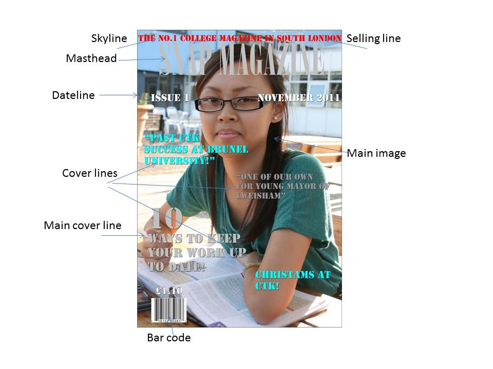
To get an idea of the basic magazine conventions, I looked for some existing school and college magazines and analysed them using LIIAR. My initial idea (which turned out to be similar to my final design, with only a few minor changes) was to have a student sat at a desk in a college environment. I would place the cover lines around them and use the Wyke logo in my masthead. Whilst taking my photographs, I thought that they turned out quite well, but realised I could have trouble finding an appropriate colour for the text. When I came to making my front cover, I used colours from the actual photo for my text. I used the purple from the Wyke logo and the black and blue from the student’s jumper. This didn't turn out completely to plan, but most of the text is still legible and the colours give the front cover a consistent theme.

The contents page however, turned out very well. I had no trouble with text colour here and the background colours worked well in making the text legible. I took two pictures of each piece of stationary, each at a different angle, to see which I liked more. I used a mixture of the first and second images in the final draft to create a more realistic feel to how the stationary is placed on the desk. There are a few minor flaws with this contents page, though. I have a bit of carpet showing in the bottom left corner and some of the stationary wasn't edited properly, so doesn't have smooth or straight edges. As it is only a draft, I am not too concerned about these flaws because I know that they could be easily fixed if I were to publish this magazine and spend more time editing it to make it perfect.

I took many pictures for both the front cover and the contents page. For the front cover I had two main ideas of where I wanted the student to be. I either wanted to have them standing up and have a medium shot of them holding some books or a folder, or have them sat at a desk reading or writing. I took photographs of both and decided that I didn't like having the student stood, as it didn't give the impression that Wyke was a college that expected its students to work hard and achieve well. I used the desk photograph as it still allowed for a good medium shot to be used and gives the readers the impression that students at Wyke work hard, but that they still enjoy it as the student featured also looks happy. I wanted my front cover to have connotations of hard-working students who put in the effort but still enjoy themselves while doing so.

For the contents page, I wanted to have a desk background and stationary dotted around a notepad with the contents listed on it. The photographs for this came out very well, and the backgrounds were plain and easy to remove. I didn't have to rotate my images in Photoshop as I took them at different angles beforehand so that I could just place them where I wanted. The only problem with these images is that some of the edges aren't straight or completely smooth as my editing skills are still yet to improve. As I mentioned earlier, I am not too concerned about this for now as it is only a mock-up contents page, not a final design, and these flaws can easily be fixed.

I produced my magazine on Photoshop so that I could remove the backgrounds on my photographs and enhance my images to make them more appealing. I used all of my own images in my magazine, as they were easier to take than the ones used for my perfume advertisement. I liked using all of my own images as it meant that I was in control of the angles that they were taken at and didn't have to spend ages looking for the perfect one on the Internet – I could just take it myself. It also meant that I could practise using my camera more to take pictures for editing, which is something I need to do. I still had some problems with Photoshop, but not as many as before. I didn't have as much editing to do this time; it was mainly just removing backgrounds and making images larger or smaller. These are things that I am quite happy about doing and I got to practise these skills even more while making this magazine.

My target audience is for students and staff at the college. There are no other people who would be interested in reading a magazine about Wyke other than those who actually go there. Any people from outside the college probably wouldn't understand a lot of it, or know where any of the places mentioned would be. I appealed to my target audience by using familiar places in the college for my images and having stationary, textbooks and students in the photographs, which all have connotations of college, work and Wyke.

The magazines I looked at for inspiration and to get an idea of basic conventions were mainly just college and school magazines that I could find on the Internet. Looking at them helped me to decide what the readers would expect to see from my magazine and how I should go about creating that. I have used a layout that I saw on many magazines - placing the title of the magazine across the top, the main image being centred so that the cover lines can go around it, and a splash in another space to give the readers extra information about what is inside.

In conclusion, I researched existing college and school magazines to get an idea of the conventions used and gain inspiration for my own magazine. I used all of my own photographs this time, and took many to compare angles and designs and think about how they would fit with the text around them. I encountered a few problems, and my front cover and contents page are far from perfect, but they get across my main ideas of how I would want my magazine to look.

If I designed this magazine again, I would most probably keep the contents page similar to this idea, maybe just change something like layout of the stationary and I would set my student against a different background for the front cover. The problems I encountered with text colours would hopefully be resolved if I found a background that didn't have so many different colours going on, making the cover lines easier to read and more prominent.

Wednesday 10 October 2012

College Magazine Contents Page


This is the contents page for me college magazine. I have used a desk as the background with stationary around the cover lines which are featured on a pad of lined paper. I have used more splashes, again as post-it notes, to create a theme between my front cover and contents page, as well as the same font.

Monday 8 October 2012

College Magazine Front Cover


This is the front cover for my college magazine. I have used an image of a student in a college environment to connect to students (the target audience for the magazine) and stats about the college that show off how great it is. I also have a splash in the shape of a post-it note with a competition featured in it to entice readers and make them want to find out how they can win, as I planned in my drafts. I have used the logo for the college in the masthead to further represent the college that the magazine is for.

Saturday 6 October 2012

Initial Idea for the Contents Page


I only have one design for my contents page as I am quite sure that this is what I want to make for my draft. It uses stationary such as a notebook, post-it notes and pens/pencils etc. to emphasise the college theme and has the actual contents printed on the notebook. By using this stationary theme, I can show the connotations of college and work, even though I have no images of the college or any students there.

Initial Idea for the Front Cover Two


My second design for the front cover only has one main difference - the main image. I wanted to have the student sat at a desk working for this one instead of stood at a place in the college. This shows that Wyke has a good environment for students to work in and that students enjoy themselves while still working hard to achieve their A-Levels. The main cover line and other cover lines are still in the same places and so is the splash, all with the same designs etc.

Initial Idea for the Front Cover One


Here is my first design for the front cover. I would like a student standing in front of a recognisable place within the Wyke campus, holding some books or a folder to emphasise that they are a student. I would place the main cover line in the lower right corner, so people see it as they turn to open the magazine and the other cover lines on the opposite side, keeping the image the centre of the magazine. I would use the Wyke logo in the title for my college as it is a recognisable feature of the college. For any splashes I would use post-it notes as they have connotations of college and work and will look at though they are "stuck" to my magazine - something that most students do when they are revising with textbooks etc.

Thursday 4 October 2012

Mood Board


This is my mood board for my college magazine. I have thought about the layout of it and done some research about other college magazines to see the basic magazine conventions. I also looked at some images of Wyke as I am thinking about including images of the buildings or campus on my front cover as the background to show that it is a college magazine.

Analysis of a Contents Page of a School Magazine


LIIAR Analysis:

Language - as it is a contents page, you would expect to see short sentences and very little language. It is to the point and delivers the information you need to find what you want to look at in the article.

Institution - again, it is a school magazine that is produced by the school, for the school. They have placed their school logo in the lower right corner and used pictures of their school and students to emphasise the point that the magazine is based around their school.

Ideology - this school conveys its beliefs of the school to be positive and hard-working. Some of the articles are on improving your revision strategies and achieving the best results, which show that the school cares for its students and wants them to do well.

Audience - the audience is primarily the students and teachers at the school as they will be the ones who will understand the school and will be interested in knowing more about it. The parents of the students may also be interested in what is happening at the school their child attends and the progress it is making.

Representation - the school want to represent themselves in a positive way and show their audience that they are hard-working and strive to help their students achieve the best results possible. This contents page also shows us that they want to keep everyone well informed and are organised about how they present themselves.

Wednesday 3 October 2012

Analysis of a Front Cover of a School Magazine


LIIAR Analysis:

Language - the language used is to the point and highlights the key points that are inside the magazine. A lot of words related to college are also used, e.g. "work", "university" and "success" to convey to the readers that the magazine is college-based. A lot of quotes are also used, these may be quotes from inside the magazine or possibly what people have said about the college and the students there, and give the readers an idea of what is to come.

Institution - the institution for this magazine is clearly the college and they have produced this magazine themselves and distribute it within the college for the students and teachers to read and keep up to date with the latest information.

Ideology - the ideology used in this magazine has a strong, positive opinion of the college. The quotes used are all positive and include information about students moving on from the college to better things. The college also conveys a strong work ethic and wants to help its students improve and keep working hard with "10 ways to keep your work up to date", which is also the main cover line.

Audience - the audience for this magazine is primarily the students and teachers at the college, and doesn't really appeal to anyone outside of the college as they won't know anything about the place. Parents of the students there may also be interested in some of the content, as it applies to the ex-students, and parents may be interested in what their children can achieve after attending the college.

Representation - the way the magazine represents itself is very confident. It has a student with their textbooks as the main image, representing the work side of the college, but then also has the "Christmas at CTK!" cover line, which shows that the college also takes part in festive activities and can take a bit of a break from work and have some fun. This helps the magazine to promote a good image for the college as it shows parents that they work their students hard and allow them achieve anything and move onto greater things, but also that the college allows them to have fun and take part in different activities.